The goal is to produce a set of gains which result in a smooth energy-response of the SMD across the plane.
The following links show iterations on a set of about 635k 62 GeV AuAu eemcCalibration data. The runs selected were during periods where the SMD and towers in sectors 5, 7 and 8 were operating without any (known) problems.
The following links show three separate runs on 200 GeV AuAu eemcCalibration data. No QA on the runs have been performed.
The 200 GeV data samples show about a 10% correction with respect to the gains iteratively determined from the 62 GeV data.
The following link shows comparisons between the gains iteratively determined from matching tower to strip response and those derived from the KSU QA measurements.
See this page for ratio of my gains to QA gains vs pixel number.
And this page for QA gains vs my gains.
Table showing the average ratio of my gains to the QA gains. All weights = 1. Pixels with low statistics, or which are dead, are not included in average.
This algorithm seems to have problems with sector 6... too many dead channels, so we're often mis-identifying something in the tail of the shower as the peak strip. Will drop sector 6 out of the proceedure for now. Will add a condition requiring 90% of the strips beneath a tower to be "good" (no fail or stat bits set), and will wait for Murad's integral gains for a starting point.
Some interesting things...
A cluster is considered to be isolated if no tower which shares SMD strips with the seed tower of the cluster exceeds 0.5 GeV.
Following are figures showing some properties of isolated clusters
Figure 1 -- cluster energy, sectors 4-9
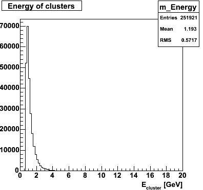
Figure 2 -- cluster locations, sectors 4-9
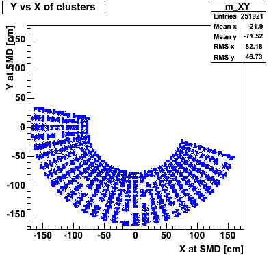
Figure 3 -- SMD response in seed tower, U vs V
Following are some results plots of the gain-matching algorthim and some explanation of the algo.
Figure 4 shows the number of MIPs reconstructed in the 07U beneath isolated seed towers. The SMD strip index is plotted on the Y axis, the estimated number of MIPs on the X axis. The histogram is only filled for the highest-responding U strip beneath the seed tower.
Figure 4 -- Response of SMD-U plane for sector 7. Left-- input Steve's gains. Right-- input gains corrected by first iteration of this method.
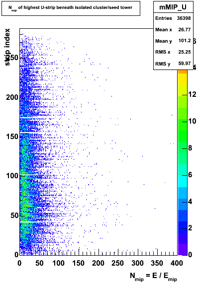

Figure 5 shows figure 4 "in profile", i.e. the average number of MIPs for each strip. (Axes are rotated w/respect to figure 4). The relative gain is determined by taking the ratio of the mean number of MIPs for a given strip to the mean number of MIPs, averaged over all strips.
Figure 5 -- Mean response of SMD-U plane for sector 7. Left-- input Steve's gains. Right-- input gains corrected by first iteration of this method.
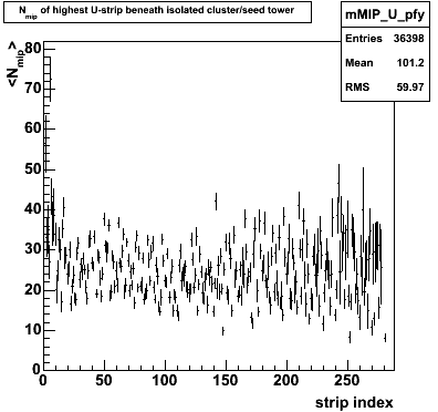
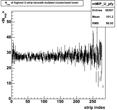
Figure 6 shows how often each strip is identified as the highest strip beath the seed tower. On subsequent iterations, this should become smooth. NOTE: I require 25 "hits" on a strip in order to make a gain correction. This ensures we don't iterate on statistical fluctuations.
Figure 6 -- Frequency plot, how often each strip is highest under seed. Left-- input Steve's gains. Right-- input gains corrected by first iteration of this method.
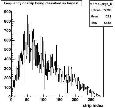
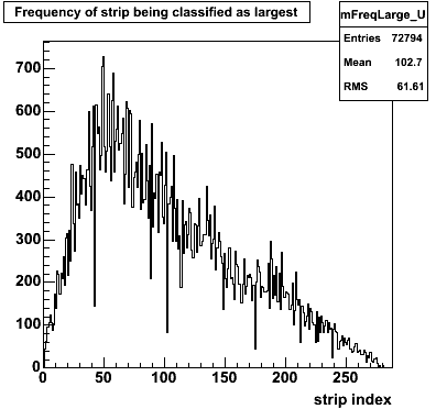
Figure 7 shows the energy of each cluster used for each strip (X and Y as with figure 1).
Figure 7 -- Energy response of clusters used to calibrate strips. Left-- input Steve's gains. Right-- input gains corrected by first iteration of this method. Two lower panels show the average cluster energy vs strip index.
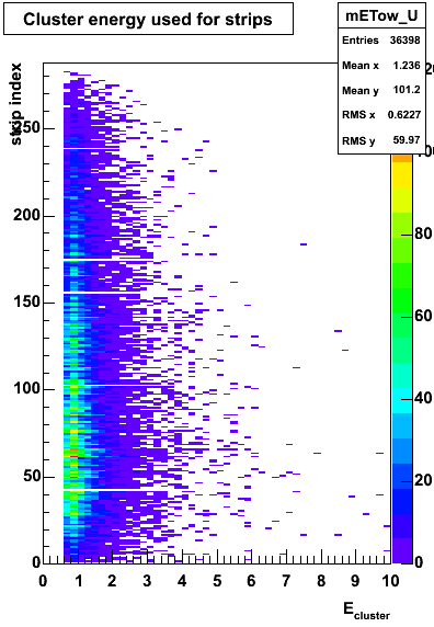
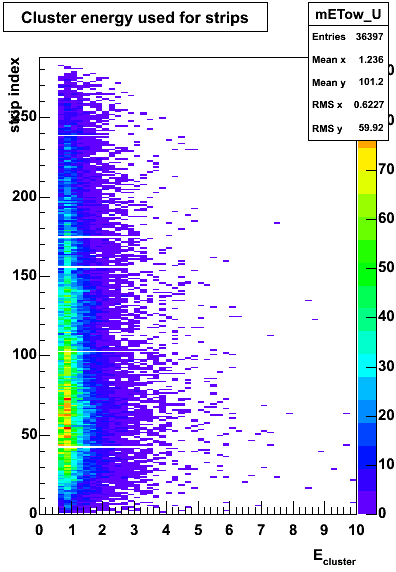
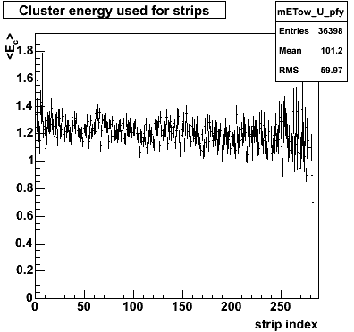
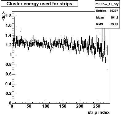
Figure 8 shows the distribution of relative gains, actually the corrections to the input gains. In figure 8b, we show two panels. The left panel shows the relative gains after the second iteation of the method. THe right panel shows the relative gains using the 2nd iteration gains as input, but using an alternate set of runs.
Figure 8a -- Distributions of relative gain corrections. Left-- input Steve's gains. Right-- input gains corrected by first iteration of this method.
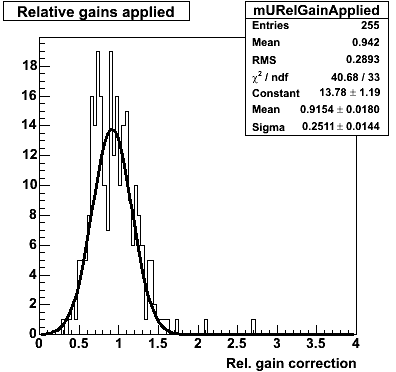
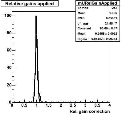
Figure 8b -- Distributions of relative gain corrections. Left -- input gains from first iteration. Right-- input gains from first iteration, process alternate set of data.
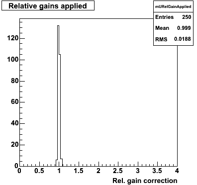
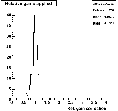
The right panel of figure B demonstrates that this method is sensitive to the gains, in that it produces corrections which are on average smaller than those corrections to Steve's gains (left panel figure 8a). The 13% RMS is perhaps consistent with the uncertainties in the corrections.